
You could measure productivity in Agile several different ways.
The most common approach is to measure Scrum itself. This would include metrics measure progress within a sprint. Another approach is to measure Lean. This would include metrics measuring how work is flowing.
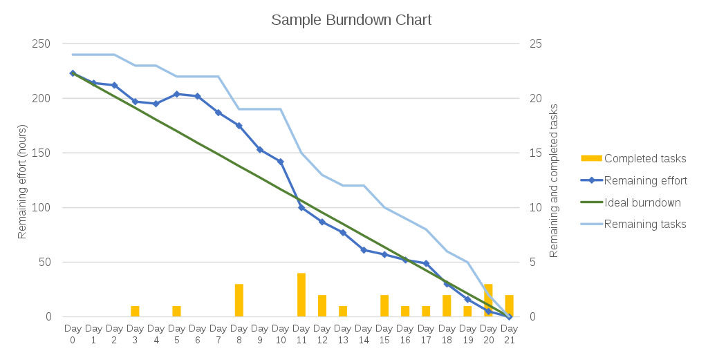
A burn down chart is a graphical representation of work left to do within a sprint. Typically the vertical axis is the outstanding work left, in terms of story points, hours or other measure. The horizontal axis is time remaining in the sprint.
The idea is to visualize progress throughout the sprint. Left on the chart, data points are high, since the sprint just started. Everyday that passes, we expect data points to drop lower and lower until hitting zero. Reaching zero should happen at the end of the sprint or earlier. At any given time, you can compare the actual burn vs the expected average.
This chart is probably the most used in Agile. But it is sort of a misleading metric. If you have backlog items with very different values assigned to them, the chart will not really represent progress accurately. What this chart should be is simply its core metric: total work left divided by total work.
Velocity is a very simple metric. It captures the quantity and value a Scrum team can generate per sprint. This metric is then used in other charts and measures.
It is also useful to plot how velocity changes over time. Is the team more productive or less productive. That being said, these trends are also misleading.
If a team is going "slower" it does not mean necessarily it is less efficient. It could be the latest measure are actually more accurate and show the team's true velocity. If that is the case, there is no point in trying to increase velocity (risking quality or other problems).
The epic burn down uses a similar concept, even though its presentation is very different. It measures how much work is still pending for an epic. An epic, is a group of backlog items working towards a specific goal.
Unlike the burn down chart, epic burn downs capture multiple sprint. They also have a (limited) forecasting ability. This is because you can use the team's velocity to gauge how long the various epics will take. This forecasting ability will work better if you use hours to assign values to backlog items. Story points, on the other hand, may not translate into real life time, or each point may not represent the same time from sprint to sprint. All these will diminish how valuable your forecast will be.
This is the time a backlog item spends as work in progress. That is, how long it takes for an item to finish after it started. Note: it is the time pending, not time working on the item. Even if nobody works on the backlog item, once started, it cycle time increases until the item is finished.
Cycle time = end date - start date +1
This is not the same as cycle time. The lead time is viewed from the perspective of total time. It is the time from when the request is made until the backlog item is finished and delivered. Depending on the audience, the lead time might include the entire period when the item was waiting in the product backlog, possibly months before being worked on. Others start the clock when the product backlog item is ready for sprinting (scheduled for the next sprint or not).
It is really important to take all these metrics with a major grain of salt. All of them -and the ten others not included here- have major flaws in their conception or usage, or both. In the Scrum guide itself, the reference after all, you will not find "burn down charts" or these other metrics. The guide does suggest to use metrics, of course, as part of inspection and transparency, but it does not specify what real metrics must be.
This is because every backlog item is likely very different from others. This lack of homogeneity means mixing apples and oranges is unavoidable. This is why metrics based on these will likely mislead. The other reason this often fails to live up to expectation is the attempt to mix two concepts in the same metrics. For instance, mixing value for customers and time to build. Separately these two measures are great and extremely useful. But combined they end up being meaningless.
You should not combine value with time, in a single metric, apples and oranges.
I recommend using better and simpler metrics. Use value (story points or other evaluation of value to users) for customers in product backlog prioritization. Use time-only based metrics (not value) for sprints, status or progress monitoring and forecasting.
Kinalta is an App for Lean Project Management
Use Kinalta to follow up and monitor multiple fast paced projects.